Chez Popina, nous avons à cœur de faciliter ton quotidien de restaurateur et nous connaissons sur le bout des doigts tes problématiques habituelles.
Ton défi majeur ? Offrir un service de qualité, tout en améliorant ton efficacité opérationnelle et donc tes profits.
C’est ici que notre nouvelle WebApp se positionne pour te faire gagner un temps précieux en simplifiant ton processus de paiement.
Comment ça marche ?
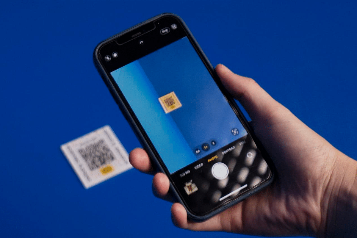
Grâce à notre nouvelle WebApp, tes clients peuvent payer directement à table, en scannant leur QRCode en fin de repas, via leur smartphone.
Ils peuvent régler par CB, tickets restaurants ou Apple Pay, choisir de répartir le montant de l’addition entre les convives ou de payer l’intégralité de la note ; de laisser un pourboire et de recevoir par mail leur ticket de caisse / facture.
Quels sont les avantages du paiement à table ?
L’expérience de ton client est améliorée : ton client se sent libre du temps passé dans ton restaurant et ta rotation des tables est optimisée. En effet, traditionnellement, le processus de paiement de tes clients peut être fastidieux et prendre du temps. Les clients patientent, cherchent parfois désespérément à croiser le regard d’un serveur sous pression, doivent attendre qu’il arrive avec le terminal de paiement, saisissent leurs codes PIN et attendent la validation. Tout cela prend du temps et peut causer de l’agitation chez des clients impatients de partir.
Les erreurs de commande et de caisse diminuent : tes clients peuvent visualiser leur commande, ajouter des plats ou des boissons supplémentaires. Les erreurs du personnel lors de la saisie des montants et la gestion des appareils sont réduites, garantissant ainsi des paiements précis.
La rotation des tables est plus rapide : tes serveurs peuvent se concentrer sur la satisfaction des clients plutôt que sur le traitement des paiements, ils gagnent en temps et en efficacité. De plus, le temps de rotation des tables est améliorée, tu pourras donc accueillir plus de clients et augmenter ton chiffre d’affaires.
La gestion des stocks est facilitée : Les données de vente sont également enregistrées automatiquement par l’application, ce qui facilite ta gestion financière et celle de tes stocks.
L’intégration avec la caisse enregistreuse Popina
Comme nos nombreuses intégrations de caisse Popina, elle sera directement installée et intégrée par notre service technique sur ta caisse enregistreuse. C’est depuis celle-ci que tu pourras imprimer tes tickets de caisse avec le QR Code à flasher.
Les tables réglées via ton intégration disparaîtront une fois le paiement effectué, et seront directement classées dans les tickets payés. Facile non ?
Toi aussi, adopte le paiement à table pour ton restaurant ! Prends rendez-vous avec notre service commercial pour en savoir plus !
En résumé, pourquoi dois-tu adopter le système de paiement à table ? Toi, restaurateur, toujours en quête de moyens d’améliorer ton service client, la solution de paiement électronique te fera gagner en productivité !
Tes clients peuvent payer la totalité ou une fraction de leur addition facilement, via leur smartphone : la WebApp prend en charge les paiements par CB, Apple Pay, les tickets-restaurant, sans attendre qu’un serveur vienne avec la note.
Tes clients peuvent également choisir d’ajouter un pourboire à leur paiement, prévenir ainsi les malentendus ou les erreurs des paiement en espèces.
En accélérant le flux de tes clients, la rotation de tes tables est optimisée ainsi que la satisfaction de tes clients. Tu obtiens en quelques clics des rapports de transactions détaillés pour une meilleure gestion de tes finances.
Notre WebApp est une solution de paiement digitale complète qui offre la simplicité de payer la note à partir de son smartphone, sans avoir à attendre la validation d’un serveur ou à se rendre à la caisse.
Définitivement, les entreprises modernes et orientées performance se tournent vers les pointeuses en ligne afin de maximiser leur productivité, d’assurer une gestion optimale et efficace du temps de travail de leurs employés, de recueillir des datas précises sur leur travail effectif.
Le Graal : une version numérique complète et vérifiée des horaires, congés et absences des salariés. Une meilleure gestion du temps de travail pour des employés épanouis dans leur job !
Alors ? Tu as une équipe à manager ? En recherche d’une pointeuse ? Découvre notre nouvel outil qui va te changer la vie ! Très complet, ce logiciel va te permettre de faciliter ton quotidien en t’apportant une aide précieuse sur l’organisation de tes plannings, et sur le pointage de tes salariés, et ce, peu importe ton domaine !
Disponible sur IOS ou Android, cet outil se compose en 2 applications et 1 site web backoffice réservé aux managers. Tu peux l’utiliser pour programmer et gérer un seul, ou plusieurs établissements. Totalement modulable, les deux fonctionnalités peuvent s’utiliser en même temps, mais il est également possible d’utiliser la gestion de planning seule, sans le système de pointage.
Pour chaque salarié, retrouve leurs informations personnelles et contractuelles directement centralisées sur ton back office. À chaque fin de contrat d’un employé, les données de son profil peuvent être archivées manuellement pour le retrouver facilement s’il est amené à revenir (en extra par exemple).
Directement depuis leur application mobile, les salariés peuvent te transmettre des documents pour leur contrat, renseigner leurs disponibilités, faire une demande de congé, et tout simplement consulter leur planning.
Enfin tous les mois, accède à un rapport comptable dans lequel sont recensées toutes les informations nécessaires à la préparation des fiches de paie.
En résumé, quelle que soit la taille de ton entreprise, avec une solution de pointage en ligne / virtuelle – ergonomique et intuitive – améliore ton processus de gestion et ton suivi du personnel. En quelques clics, synthétise les heures travaillées par tes employés, reçois des rapports d’activité précis, affine ta stratégie RH en disposant d’une vue plus large sur les performances de chacun des membres de ton personnel.
Finis-en avec le casse-tête quotidien des plannings !
Un point essentiel qui facilitera ton organisation et te fera gagner un temps précieux chaque semaine : la création de planning !
Depuis ton back office, il est possible de créer facilement des plannings grâce à une interface ludique et simple d’utilisation. Il suffit de recenser les horaires et les indisponibilités de chacun de tes salariés, pour pouvoir élaborer un planning qui prend en compte les différentes contraintes.
Chaque semaine, tu peux dupliquer facilement ton ou tes plannings pour les reconduire et les modifier. Tu peux également choisir de créer un planning par pôle (ex : pôle service, pôle cuisine, pôle encaissement,…).
Et côté salarié ? Tes employés peuvent suivre facilement leur planning depuis l’application mobile à laquelle ils ont accès. Ils reçoivent une notification à chaque publication de planning, et lorsque des changements sont effectués.
Ta nouvelle pointeuse 3.0 !
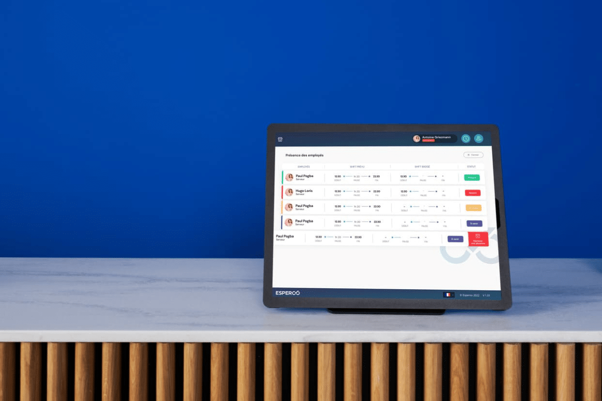
Cette fonctionnalité te permet de pointer les horaires de tes équipes avec ou sans connexion à internet. Tu peux choisir de mettre à disposition une tablette dédiée à ton pointage ou bien de tout faire depuis un seul iPad.
Une fois encore, cet outil est modulable à souhait. Tu peux choisir de faire pointer tes employés chaque début et fin de journée, mais il est également possible de demander de pointer au moment des pauses.
Concernant les modes de pointage, il existe 3 options cumulables ou non :
Pointage par code pin : cette option est obligatoire à chaque pointage. Lors de leur identification, les salariés rentrent simplement un code pin personnel pour mentionner leur arrivée
A cela peuvent s’ajouter : Pointage par photo : les salariés pointent leur arrivée sur la tablette en prenant une photo d’eux, afin de valider leur identité
Pointage par signature : pour renforcer le pointage la signature permet de sécuriser davantage l’identité du salarié
Il est possible de suivre à distance le pointage de tes salariés, si un oubli a été constaté, tu seras automatiquement informé par une notification. Ainsi, tu pourras voir directement avec le salarié concerné les raisons de son absence, ou pointer à sa place s’il a omis de le faire.
En bref, tu l’auras compris, cette nouvelle solution est un gain de temps considérable. Alors libère-toi du temps pour te consacrer à l’essentiel !
Si tu nous suis depuis quelque temps, tu n’as pas pu passer à côté. Popina s’est refait une beauté : site, stands, vêtements, goodies, communication globale… l’identité a radicalement changé. Pourquoi changer d’identité ? Quels ont été les processus de réflexion et de création ? Quelle est la suite pour Popina ? Nouveau look pour une nouvelle vie, nous vous dévoilons toutes les raisons de ce virage à 360° 😉. Zoom sur notre histoire, nos envies, nos besoins, nos inspirations et les changements majeurs que tu as pu/pourras constater.
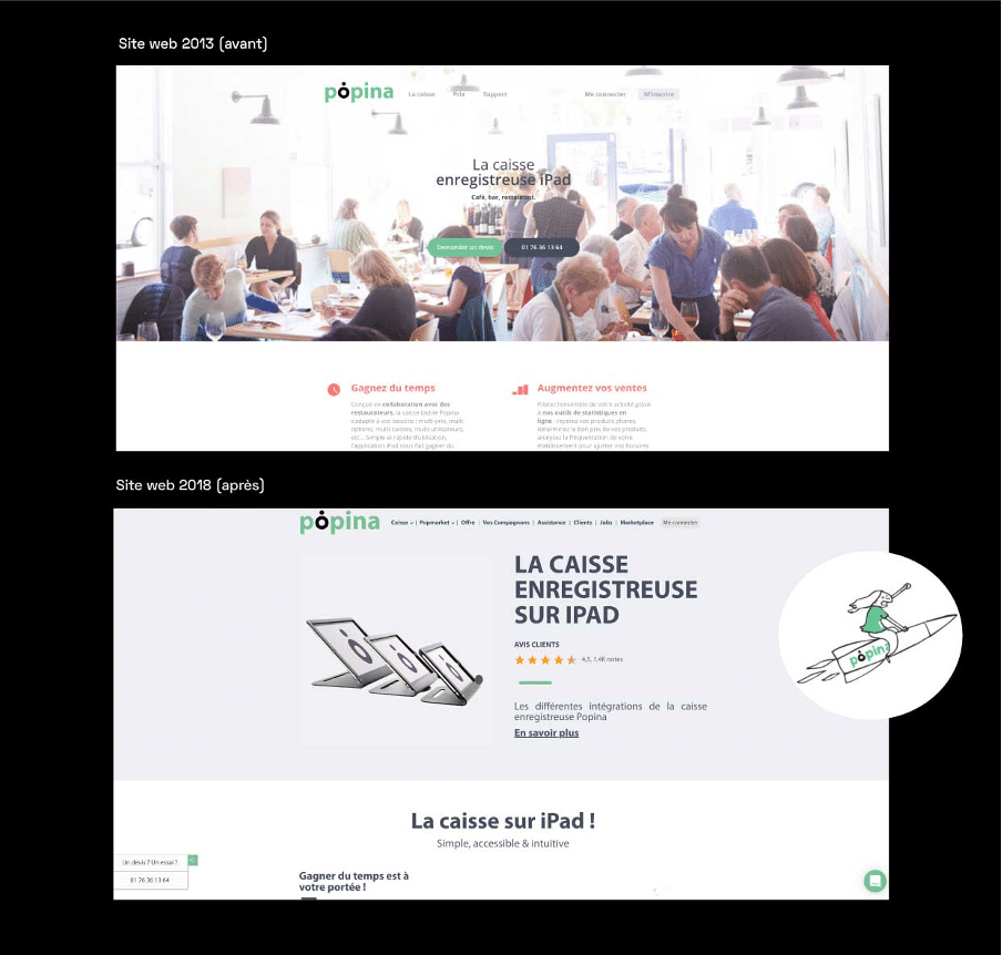
Reprenons l’histoire à ses débuts : naissance de Popina, nous sommes en 2013. Le vert “nature” est prédominant, nos clients sont des restaurateurs principalement et l’équipe se résume à quatre personnes dans un appartement de 30 m². On grossit volontairement le trait, mais tu as l’idée ! À l’époque, l’identité avait été imaginée par l’un des papas de Popina, inspiré par la mode de l’époque. Notre vision ? Une identité visuelle froide, minimaliste, pour un outil moderne et efficace. Notre mantra ? Popina s’adapte à vos besoins et non l’inverse. Ainsi, le vert/blanc choisit sont rassurants, techniques, (presque) aseptisés. Nous souhaitions que notre identité visuelle “s’oublie” au profit de celles de nos clients restaurateurs. Le logo, quant à lui, est pensé à l’effigie de leurs établissements. Minimaliste, c’est un logo typographique (avec un twist du point sur le “o”) qui représente une assiette et un verre vus du dessus.
2019, refonte du site vitrine
Petit bond dans le temps : 2019, Popina grandit, ses services s’étoffent. Internet change, alors nous nous adaptons à toutes ces évolutions en développant un nouveau site. Nous sommes partis du site internet existant pour le moderniser et nous en avons extrait quelques mots clés pour mieux nous raconter. Le site vitrine est refait, mais globalement, l’identité visuelle demeure. Des illustrations sont ajoutées et ponctuent les pages pour accentuer le storytelling*. Le ton est plus léger et renforce la proximité que nous voulons transmettre à nos clients. *narration
État de lieux de Popina
4 ans plus tard : 2023, Popina en quelques chiffres.
+ de 5 000 clients, 40 salariés, deux bureaux (Paris et Barcelone), 5 salons professionnels/an, 11 nouvelles versions de l’application, 4,5 étoiles sur l’App Store et 1 500 parties de billard plus tard… le constat s’impose, Popina évolue vite !
Il est temps de repenser complètement notre identité pour communiquer différemment. Sans renier nos anciennes identités, ce changement s’inscrit dans une volonté de mieux coller à l’image d’aujourd’hui et de celle que l’on veut donner. Popina évolue dans un monde digital qui bouge constamment. Nous avions démarré avec un mono-produit, maintenant, c’est plus d’une trentaine de produits connectés, services et accessoires, que nous proposons à nos clients. Encaissement, hygiène HACCP,PMS hôtelier, paiement à table ou encore, pourboire dématérialisé… autant de fonctionnalités qui peuvent t’aider à gérer ton établissement et qu’il a fallu représenter. Le processus de refonte d’identité est lancé !
Brainstorming & Brief
Pas de refonte possible sans brief et recherche graphique. Et pour commencer, il a fallu définir qui nous sommes.
Étape 1 : Popina, qu’est-ce que c’est ?
Pour mettre en avant nos valeurs principales ; nous avons questionné nos salariés. Popina, pour toi et en quelques mots, qu’est-ce que c’est ? On fait quoi ? On raconte quoi ? On s’adresse à qui ? Pour ce projet, nous avons sélectionné 17 collaborateurs de Popina parmi les différents pôles de la société. Les profils ont été choisis de manière à représenter Popina dans sa globalité (personnes avec plus d’ancienneté, et d’autres plus récemment embauchés). Ce qui est ressorti nous a permis de mieux cibler nos besoins et envies. Popina est une entreprise dans le secteur de la tech**, jeune, familiale, dynamique et sérieuse, qui propose des services digitaux, en constante évolution. Il faut maintenant lui créer une identité sur-mesure. **technologie
Étape 2 : Établir le brief
Notre axe de travail principal était l’identité graphique (nouvelle typographie, modernisation du logo, recherche des couleurs), pour qu’en découle une nouvelle identité visuelle générale, une refonte de site, et une communication globale associée. Pour Popina, nous souhaitions avant tout affirmer notre positionnement, communiquer nos valeurs, témoigner de notre innovation, de l’app’ jusqu’au développement de notre site internet. Le tout, grâce à une identité visuelle dynamique, moderne et sérieuse.
Étape 3 : Nos inspirations & problématiques graphiques
Dans nos inspirations, plusieurs mots clés sont ressortis : “streetwear”, “sport”, “tech/digital” “pop”, “néo”… Des concepts qu’il a fallu transformer graphiquement, et associer à nos problématiques, pour que tout fonctionne ensemble. Et par “problématiques” nous entendons les usages, les déclinaisons, les supports où notre identité visuelle devra exister. Imagine un rouge vif, une typographie hachée, des pictogrammes anguleux… Tous ces éléments graphiques crient la même chose : “attention, danger”. Autant de paramètres qui sont à prendre en compte lorsque tu établis une nouvelle identité graphique. Nous avons passé en revue notre ancienne identité visuelle. Qu’est-ce qu’on garde tel quel ? Qu’est-ce qu’on modernise, upgrade ? Qu’est-ce qu’on retravaille ? En résumé : un peu d’ancien, un peu de nouveau, pour une joyeuse tambouille visuelle.
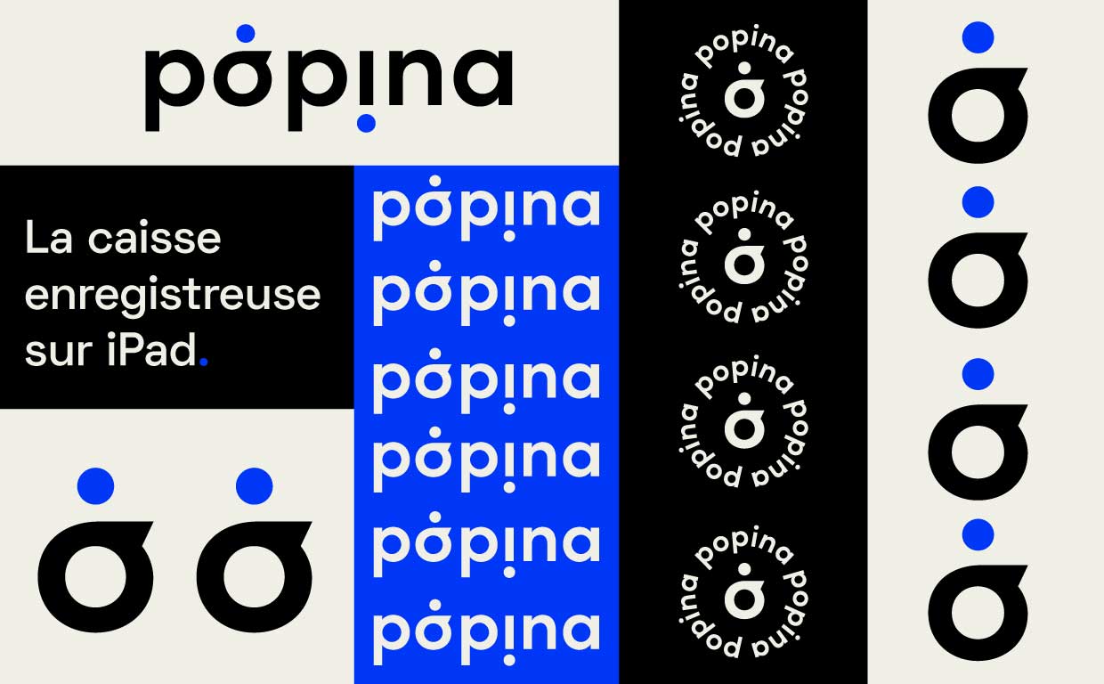
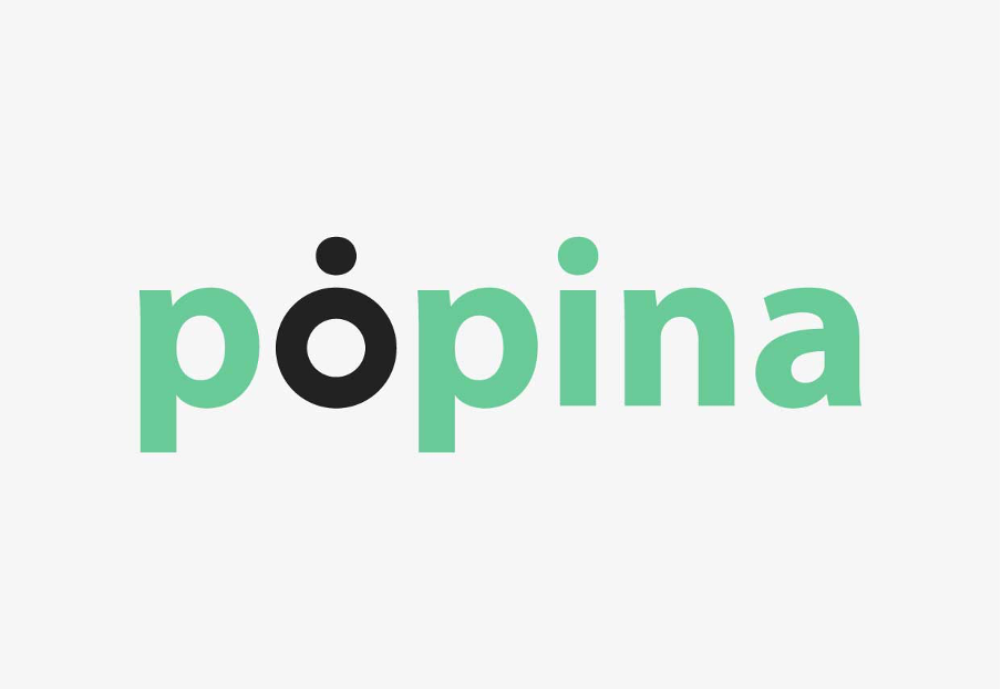
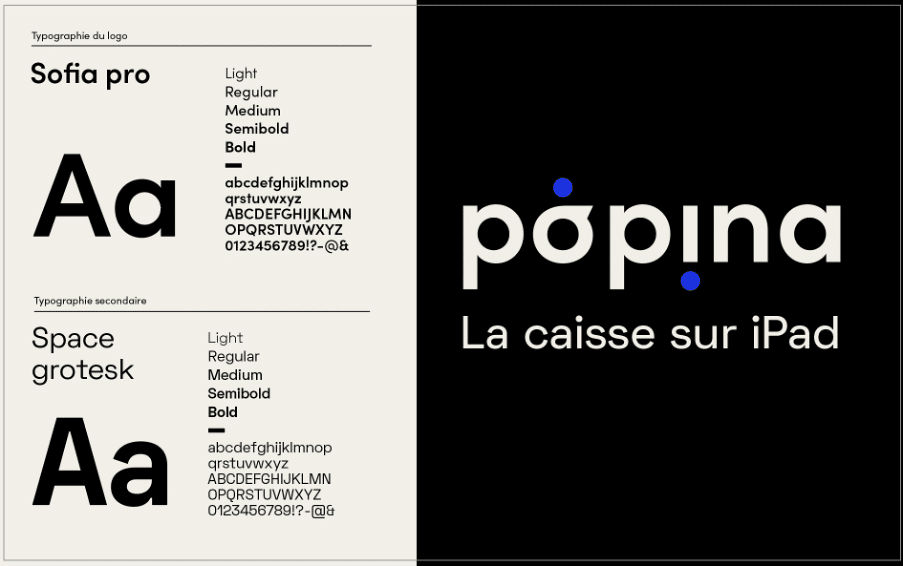
Le logo
Chez Popina, notre logo typographique, on l’aime bien. Il représente ce que nous sommes et comment nous avons débuté. Nous souhaitions le conserver dans sa simplicité, son minimalisme et son efficacité. D’autant plus que nos clients, partenaires et collaborateurs le connaissent bien. Moderniser oui, mais sans se métamorphoser complètement, nous tenions à être reconnu.
La typo
Pas de secret entre nous, jusqu’à présent, nous avions opté pour la Myriad Pro. Et si tu n’es pas familier avec son nom, sache que c’est une police “passe-partout”. Une “police claire et parfaitement neutre”, si on en croit même sa fiche Wikipédia. Pas idéale quand tu souhaites t’affirmer : ce sera notre premier chantier !
Les couleurs
Et le choix des couleurs dans tout ça ? Il est crucial ! Il faut qu’elles fonctionnent aussi bien sur le print que sur le web, qu’elles tranchent avec nos concurrents, qu’elles se voient de loin sur les salons, qu’elles ne changent pas en fonction des qualités d’impression… Les idées sont lancées, après avoir déterminé les valeurs de l’entreprise, établi le brief et effectué la veille graphique (tout en gardant en tête nos problématiques) ; c’est notre (incroyable) équipe de graphistes qui a pris le relai.
Les changements de l’identité visuelle
Il est là, il est beau, tu le sais, tu navigues dessus. Bienvenue sur notre nouveau site internetempreint de notre nouvelle identité visuelle ! Alors Popina 2.3, ça donne quoi ?
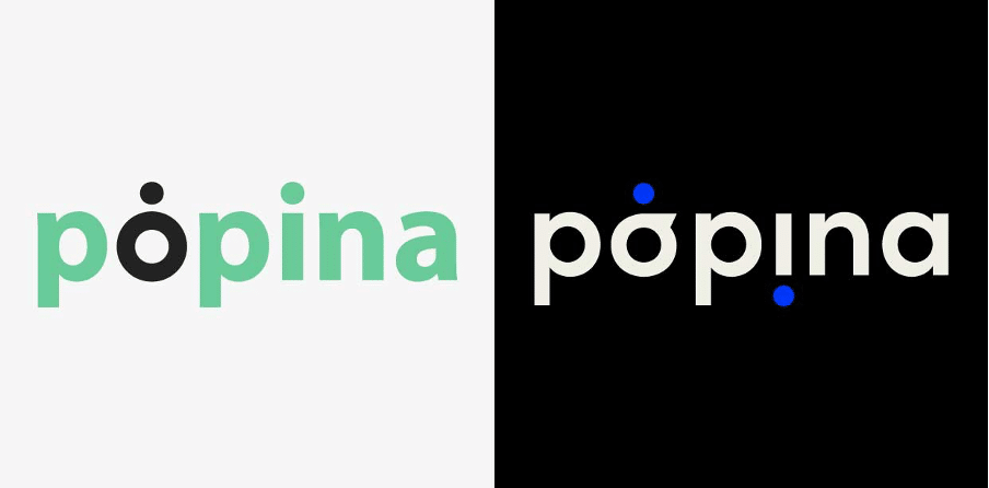
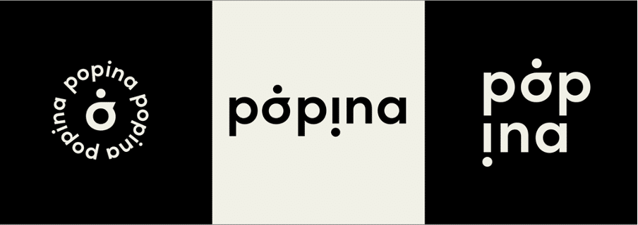
Un logo modernisé…
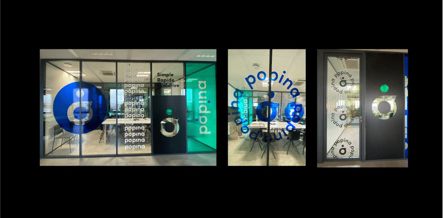
… Qui reprend les codes de l’ancien. Nous ne nous adressons plus uniquement aux restaurateurs, ni au secteur CHR*. Dorénavant, c’est tous les secteurs/métiers que nous pouvons équiper et que nous souhaitons représenter. Le logo est plus marqué. Avec l’ajout de la pointe sur le “o” du logo, nous lui avons donné plus de dynamisme, il semble bouger. L’idée était de l’utiliser au maximum, de le décliner à l’infini, de jouer avec lui comme un motif, comme sur notre vitrophanie de bureau par exemple.
Nous avons joué avec le logo, avec son opacité. Il fait entrer la lumière dans certaines pièces, tamise d’autres. Notre inspiration : le street art. Flèche, fusée, adaptabilité, c’est l’énergie que nous voulons transmettre. En poussant le concept, nous pourrions même évoquer l’avenir de Popina, l’innovation omniprésente de notre métier et nos ambitions pour la suite. 🚀
Une typographie singulière
La typographie que nous utilisons pour le logo est la SOFIA PRO, une police sans empattement, conçue par Olivier Gourvat. Droite, pragmatique, elle apporte de la modernité au logo sans en changer ses fondements. Pour le reste de nos supports, c’est pour la SPACE GROTESK que nous avons opté. Tout comme la Sofia Pro, c’est une police sans empattement, singulière, conçue par Florian Karsten en 2018. Avec ses caractères « monospace », elle nous rappelle l’univers du digital, de la tech. Nous voulions qu’elle soit rassurante, marquée, tout en étant adaptable et accessible. Avec les deux polices, nous conservons un esprit de proximité !
Des couleurs tranchées
Les couleurs ont été repensées. Bye-bye le vert “nature”. Bonjour le bleu électrique ! Nous avons opté pour une couleur principale “tape à l’œil” qui fonctionne bien seule ou associée au noir et au beige, nos couleurs secondaires. Le bleu est dynamique, il inspire la confiance, la sérénité. Le noir est directif, rassurant. Le beige est notre couleur “stable”, la couleur neutre qui apaise l’œil.
Nouvelle identité, pour une infinité de possibilités
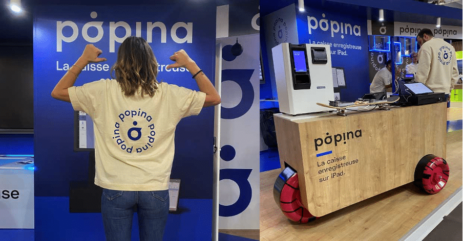
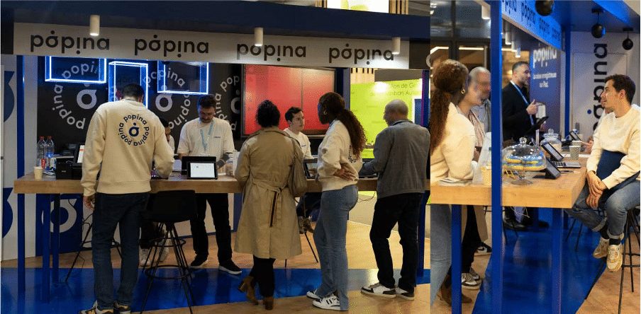
La refonte du site était indispensable pour expliquer nos nombreux produits et nos services. Nous espérons que tu arriveras à t’acclimater à ces changements de navigation et plus globalement, à cette nouvelle identité qui prend forme au fil des pages. Côté salons, nos stands sont désormais bleus & bois, pour plus de chaleur et de convivialité ! La charte graphique est utilisée dans les moindres recoins. La flèche au sol reprend la pointe de notre logo, les goodies sont marqués “Popina”. Nous avons même fait fabriquer un chariot avec des roues de skate qui se déplace comme on veut. Il évoque notre mobilité et le côté “street” qui nous plaisait tant. Enfin, parce que nos collaborateurs sont nos meilleurs ambassadeurs, nous leur avons imaginé une ligne de streetwear, unisexe, en coton écocert. Sweat et t-shirts, la collection est beige, pour adoucir le bleu des stands. Chez Popina, sérieux, confort & chill avant tout !
Nous avons hâte de lire ou d’entendre vos réactions, d’autres surprises arrivent. Popina nouvelle version, pari réussi ? Convaincu(e) par notre nouvelle identité ? Tu veux en savoir (toujours) plus sur Popina ?
Popina se félicite d’arriver à la première place du classement des logiciels de caisses enregistreuses sur iPad. Génial ! Nous savons que nous avons réalisé un logiciel de qualité, nous le pratiquons tous les jours et nos plus de 3500 clients en sont satisfaits ! Mais est-ce suffisant pour atteindre la première place ? A quoi cela tient-il ? Y-a-t-il des critères de classement précis ? Nous allons tenter de répondre à ces questions pour vous.
Le poids de chaque critère dans l’algorithme… un secret bien gardé…
Mais pas tout à fait non plus ! La position d’une application dans l’Appstore est savamment calculée grâce à un algorithme prenant en compte 3 critères :
Le volume de téléchargements sur la journée (environ 30 000 / jour sur l’Appstore et 40-50 000/jour sur Android).
La fréquence d’utilisation et le temps de session
La qualité, soit la moyenne des notes utilisateurs : de 1 à 5 étoiles.
Dans ces trois critères, il est clair que la note des utilisateurs pèse de façon très conséquente dans la balance.
Quel est le véritable intérêt d’être Number 1 sur l’Appstore ?
Il faut tout d’abord prendre conscience que le fait d’être à la première place du classement, permet d’avoir une visibilité absolue de l’application ! Elle est visible par tous les utilisateurs et les futurs utilisateurs accédant à la page « Classements» !
Cela a un impact très important car plus de 60% des utilisateurs découvrent une application en faisant une recherche dans l’Appstore ou en regardant le classement ! Ensuite cela dépend des applications, mais en général, une application trônant sur la première place du podium génère 100% de téléchargements ! Rendez-vous compte ! Objectif atteint !
Vous l’aurez compris, qui dit première place sur le podium, dit : VISIBILITÉ, TÉLÉCHARGEMENTS et NOTORIÉTÉ ! L’objectif étant de développer de l’audience tout en ciblant ses utilisateurs « cœurs de cible », c’est le nerf de la guerre, Popina, N°1 de l’Appstore continue sur sa lancée, direction, les étoiles !