At Popina, we're passionate about making your life as a restaurant owner easier, and we know your everyday challenges inside out.
Your biggest challenge? Offering a quality service, while improving your operational efficiency and therefore your profits.
That's where our new WebApp comes in, saving you precious time by simplifying your payment process.
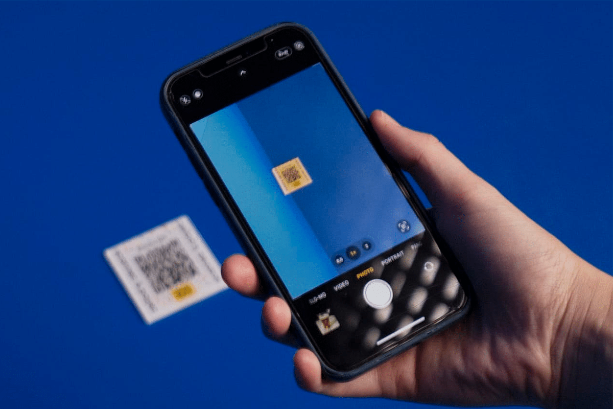
How does it work?
Thanks to our new WebApp, your customers can pay directly at the table by scanning their QR code at the end of their meal via their smartphone.
They can pay by credit card, meal vouchers or Apple Pay, choose to split the bill between guests or pay the entire amount, leave a tip and receive their receipt/invoice by email.
What are the advantages of paying at the table?
Your customer's experience is improved: your customer feels free about the time spent in your restaurant and your table turnover is optimized. Indeed, traditionally, the payment process for your customers can be tedious and time-consuming. Customers wait, sometimes desperately trying to catch the eye of a pressured waiter, have to wait for them to arrive with the payment terminal, enter their PIN codes and wait for validation. All this takes time and can cause agitation among customers who are impatient to leave.
Fewer mistakes when ordering and paying: Your customers can see their order and add extra dishes or drinks. Staff errors when entering amounts and managing devices are reduced, ensuring accurate payments.
Faster table turnover: Your servers can focus on keeping customers happy instead of processing payments, saving time and boosting efficiency. Plus, with faster table turnover, you can welcome more customers and increase your revenue.
Easier inventory management: Sales data is also automatically recorded by the app, making it easier to manage your finances and inventory.
Integration with the Popina cash register
Like our many Popina cash register integrations, it will be installed and integrated directly by our technical service on your cash register. From there, you can print your receipts with the QR code to scan.
Tables paid via your integration will disappear once the payment is made and will be directly classified in the paid tickets. Easy, right?
You too, adopt the payment at the table for your restaurant! Book an appointment with our sales department to find out more!
In short, why should you adopt the payment at the table system? You, as a restaurant owner, always looking for ways to improve your customer service, this electronic payment solution will boost your productivity!
Your customers can easily pay all or part of their bill via their smartphone: the WebApp supports payments by credit card, Apple Pay, and restaurant vouchers, without waiting for a server to bring the check.
Your customers can also choose to add a tip to their payment, preventing misunderstandings or errors with cash payments.
By speeding up customer flow, your table turnover is optimized, as well as your customer satisfaction. You get detailed transaction reports in just a few clicks for better financial management.
Our WebApp is a complete digital payment solution that offers the simplicity of paying the bill from your smartphone, without having to wait for a server to validate or go to the checkout.
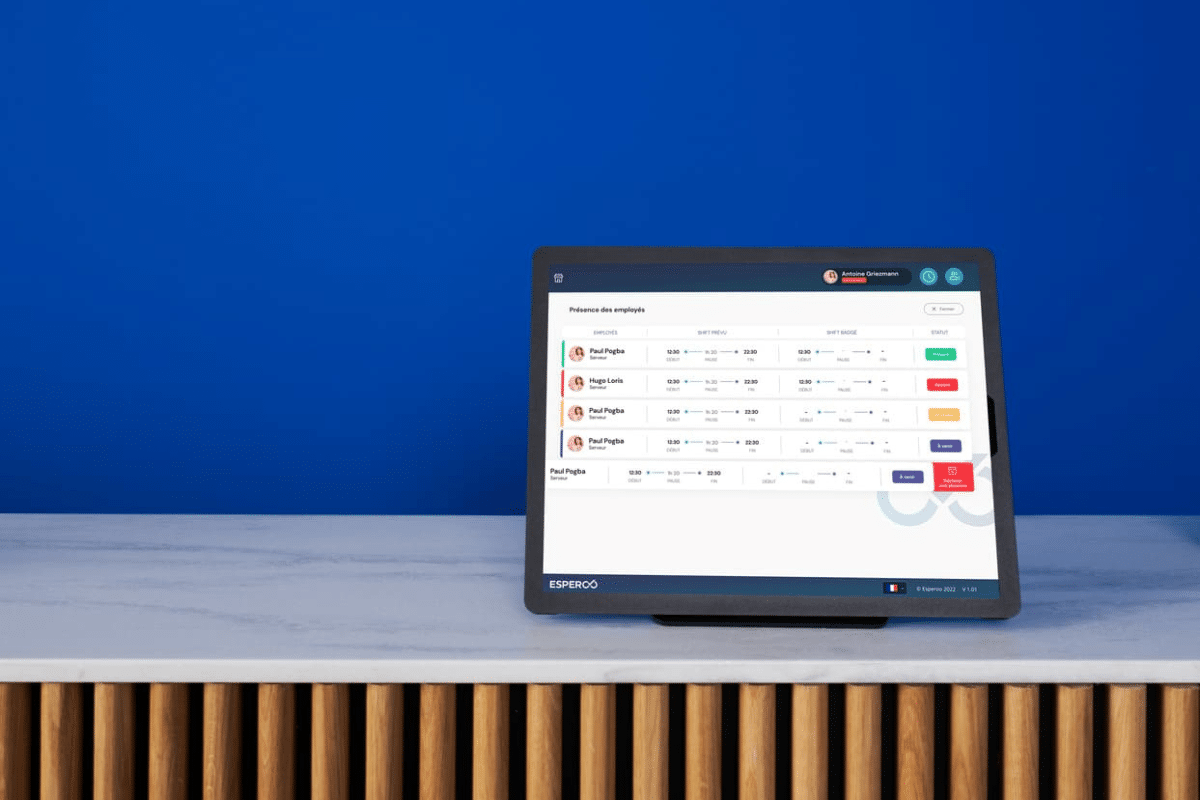
Modern, performance-oriented companies are definitely turning to online time clocks to maximize their productivity, ensure optimal and efficient management of their employees' working time, and collect accurate data on their actual work.
The Holy Grail: a complete and verified digital version of employee schedules, leave, and absences. Better management of working time for employees who are happy in their jobs!
So, got a team to manage? Looking for a time clock? Discover our new tool that will change your life! This comprehensive software will make your daily life easier by providing valuable assistance with organizing your schedules and tracking your employees' hours, no matter your industry!
Available on iOS or Android, this tool consists of 2 apps and 1 back-office website for managers. You can use it to schedule and manage one or more establishments. Fully customizable, the two features can be used simultaneously, but it's also possible to use the scheduling management alone, without the time clock system.
For each employee, you can find their personal and contractual information centralized directly in your back office. At the end of an employee's contract, their profile data can be manually archived for easy retrieval if they return (e.g., as an extra).
Directly from their mobile app, employees can send you documents for their contract, indicate their availability, request time off and simply view their schedule.
Finally, every month, access an accounting report that compiles all the information needed to prepare payroll.
In short, whatever the size of your company, an ergonomic and intuitive online / virtual time clock solution improves your management process and employee tracking. In just a few clicks, summarize the hours worked by your employees, receive accurate activity reports and refine your HR strategy by having a broader view of the performance of each of your staff members.
Say goodbye to the daily scheduling headache!
An essential point that will simplify your organization and save you valuable time each week: creating schedules!
From your back office, you can easily create schedules thanks to a user-friendly and easy-to-use interface. Simply record the schedules and unavailability of each of your employees to develop a schedule that takes into account the various constraints.
Each week, you can easily duplicate your schedules to renew and modify them. You can also choose to create a schedule per department (e.g., service department, kitchen department, cashier, etc.).
What about the employee side? Your employees can easily follow their schedule from the mobile app they have access to. They receive a notification each time a schedule is published, and when changes are made.
Your new 3.0 time clock!
This feature allows you to track your teams' hours with or without an internet connection. You can choose to provide a dedicated tablet for your time clock or do everything from a single tablet.
Once again, this tool is fully customizable. You can choose to have your employees clock in at the beginning and end of each day, but it's also possible to require them to clock in during breaks.
Regarding clocking methods, there are 3 options that can be combined or not:
Clocking by PIN code: this option is mandatory for each clocking. During their identification, employees simply enter a personal PIN code to indicate their arrival.
To this can be added: Clocking by photo: employees clock in on the tablet by taking a photo of themselves to validate their identity.
Clocking by signature: to reinforce the clocking, the signature helps to further secure the employee's identity.
It is possible to monitor your employees' clocking remotely; if an oversight is noticed, you will be automatically informed by a notification. This way, you can directly discuss the reasons for their absence with the employee concerned, or clock in for them if they forgot to do so.
In short, as you can see, this new solution is a considerable time saver. So free up your time to focus on what's essential!
If you've been following us for a while, you couldn't have missed it. Popina has had a makeover: website, stands, clothing, goodies, overall communication... the identity has radically changed. Why change identity? What were the thought and creation processes? What's next for Popina? New look for a new life, we reveal all the reasons for this 360° turn 😉. Zoom in on our history, our desires, our needs, our inspirations, and the major changes that you may/will have noticed.
Let's rewind to the beginning: Popina was born in 2013. "Natural" green was the main color, our customers were mostly restaurant owners, and the team consisted of four people in a 30 m² apartment. We're exaggerating a bit, but you get the idea! Back then, the identity was created by one of Popina's founders, inspired by the trends of the time. Our vision? A cold, minimalist visual identity for a modern and efficient tool. Our mantra? Popina adapts to your needs, not the other way around. So, the chosen green/white colors are reassuring, technical, (almost) sterile. We wanted our visual identity to "disappear" in favor of those of our restaurant clients. The logo, meanwhile, was designed to reflect their establishments. Minimalist, it's a typographic logo (with a twist on the dot of the "o") that represents a plate and a glass seen from above.
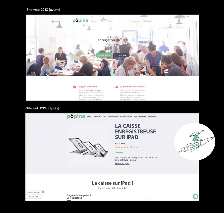
2019, revamp of the showcase site
Fast forward a bit: 2019, Popina is growing, and its services are expanding. The internet is changing, so we're adapting to all these developments by developing a new site. We started with the existing website to modernize it, and we extracted a few keywords to better tell our story. The showcase site has been redone, but overall, the visual identity remains. Illustrations are added and punctuate the pages to accentuate the storytelling*. The tone is lighter and reinforces the closeness we want to convey to our customers. *narration
State of affairs at Popina
4 years later: 2023, Popina in numbers.
Over 5,000 customers, 40 employees, two offices (Paris and Barcelona), 5 trade shows/year, 11 new versions of the application, 4.5 stars on the App Store, and 1,500 games of pool later... it's clear that Popina is evolving fast!
It's time to completely rethink our identity to communicate differently. Without disowning our old identities, this change reflects a desire to better match today's image and the one we want to project. Popina is evolving in a constantly changing digital world. We started with a single product, but now we offer our customers more than thirty connected products, services, and accessories. Checkout, HACCP hygiene,hotel PMS, table payment or even, digital tipping... so many features that can help you manage your business and that needed to be represented. The identity redesign process is launched!
Brainstorming & Brief
No redesign is possible without a brief and graphic research. And to begin with, we had to define who we are.
Step 1: Popina, what is it?
For highlight our core values ; we asked our employees. Popina, what does it mean to you in a few words? What do we do? What's our story? Who are we talking to? For this project, we selected 17 Popina employees from the company's various departments. The profiles were chosen to represent Popina as a whole (people with longer tenure and others who were hired more recently). What came out of it helped us to better target our needs and desires. Popina is a company in the tech**sector, young, family-oriented, dynamic and serious, offering digital services that are constantly evolving. Now we need to create a custom-made identity for it. **technology
Step 2: Establishing the brief
Our main focus was on thegraphic identity (new typography, logo modernization, color research), so that a new general visual identity, a website redesign, and associated global communication would follow. For Popina, we wanted above all to affirm our positioning, communicate our values, showcase our innovation, from the app to the development of our website. All thanks to a dynamic, modern and serious visual identity.
Step 3: Our inspirations & graphic issues
In our inspirations, several keywords emerged: "streetwear", "sport", "tech/digital" "pop", "neo"... Concepts that had to be transformed graphically and associated with our issues, so that everything works together. And by "issues" we mean the uses, variations, and supports where our visual identity will have to exist. Imagine a bright red, a choppy typography, angular pictograms... All these graphic elements scream the same thing: "attention, danger". So many parameters to take into account when establishing a new graphic identity. We reviewed our old visual identity. What do we keep as is? What do we modernize, upgrade? What do we rework? In short: a little old, a little new, for a joyful visual mix.
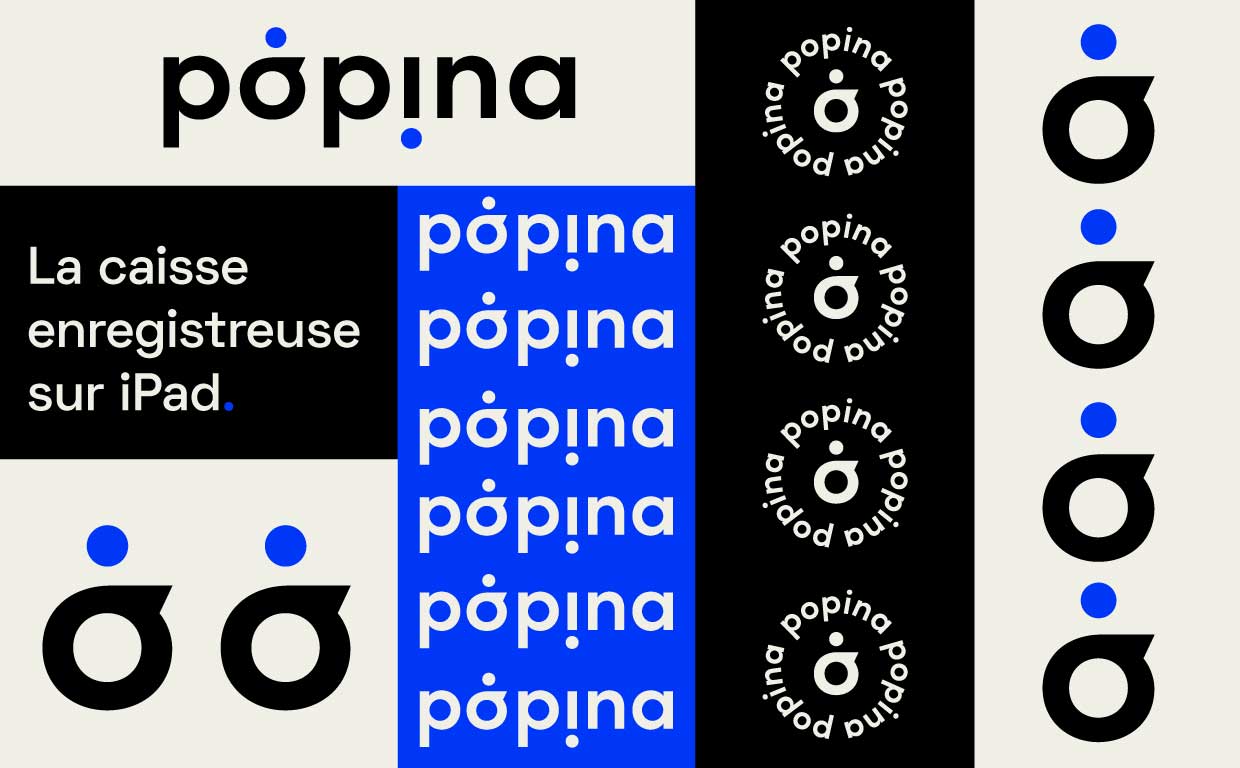
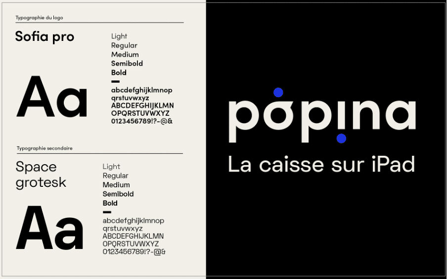
The logo
At Popina, we really like our typographic logo. It represents what we are and how we started. We wanted to keep it simple, minimalist and effective. Especially since our customers, partners and employees know it well. Modernize yes, but without completely transforming ourselves, we wanted to be recognized.
The font
No secrets here, until now, we had opted for Myriad Pro. And if you're not familiar with its name, it's a "one-size-fits-all" font. A "clear and perfectly neutral font", if we even believe its Wikipedia page. Not ideal when you want to assert yourself: this will be our first project!
The colors
And what about the choice of colors? It's crucial! They must work as well on print as on the web, they must stand out from our competitors, they must be seen from far at trade shows, they must not change depending on the printing qualities... The ideas are launched, after having determined the values of the company, established the brief and carried out the graphic watch (while keeping in mind our problems); it is our (incredible) team of graphic designers who took over.
The changes to the visual identity
It's here, it's beautiful, you know it, you're browsing it. Welcome to our new websiteimprinted with our new visual identity! So what does Popina 2.3 look like?
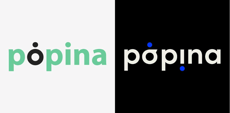
An updated logo…
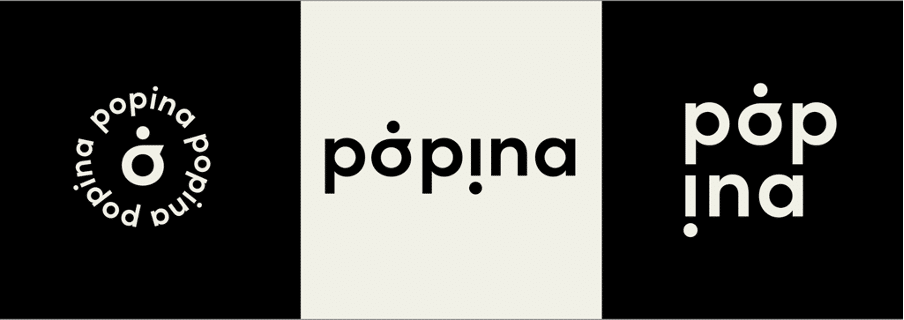
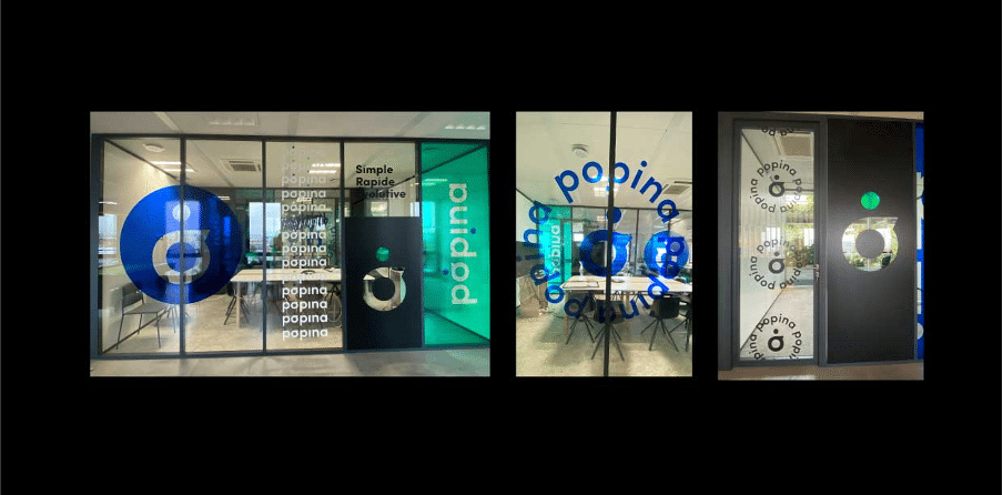
…That still feels familiar. We're not just talking to restaurant owners or the hospitality sector anymore*. Now, we can equip all kinds of businesses and want to represent them all. The logo is bolder. By adding the point on the "o" in the logo, we've made it more dynamic, it looks like it's moving. The idea was to use it as much as possible, to adapt it endlessly, to play with it like a pattern, like on our office window film, for example.
We played with the logo, with its transparency. It lets light into some rooms and dims others. Our inspiration: street art. Arrow, rocket, adaptability – that's the energy we want to convey. By pushing the concept further, we could even evoke the future of Popina, the ever-present innovation in our business, and our ambitions for the future. 🚀
A unique typography
The typography we use for the logo is SOFIA PRO, a sans-serif font designed by Olivier Gourvat. Straightforward and pragmatic, it brings modernity to the logo without changing its foundations. For the rest of our materials, we opted for SPACE GROTESK. Like Sofia Pro, it's a sans-serif, unique font designed by Florian Karsten in 2018. With its "monospace" characters, it reminds us of the digital, tech world. We wanted it to be reassuring, bold, yet adaptable and accessible. With both fonts, we maintain a spirit of closeness!
Striking colors
The colors have been rethought. Bye-bye "natural" green. Hello electric blue! We opted for a "catchy" main color that works well alone or in combination with black and beige, our secondary colors. Blue is dynamic and inspires confidence and serenity. Black is direct and reassuring. Beige is our "stable" color, the neutral color that soothes the eye.
New identity, for endless possibilities
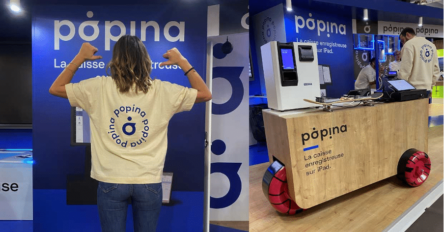
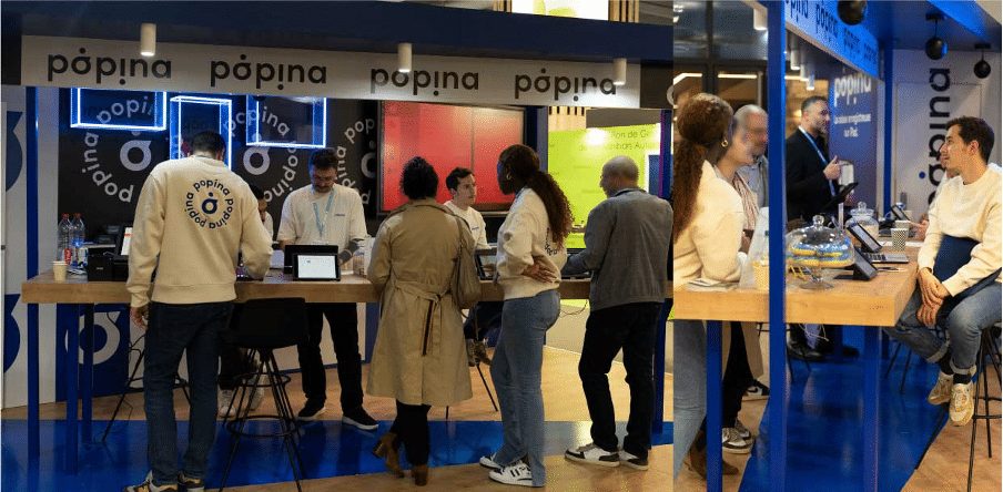
The website redesign was essential to explain our many products and services. We hope you'll get used to these navigation changes and, more generally, to this new identity that's taking shape throughout the pages. On the trade showside, our stands are now blue & wood, for more warmth and friendliness! The graphic charter is used in every nook and cranny. The arrow on the floor echoes the point of our logo, and the goodies are marked "Popina." We even had a cart made with skateboard wheels that moves as we want. It evokes our mobility and the "street" side that we liked so much. Finally, because our employees are our best ambassadors, we've designed a unisex streetwear line for them in organic cotton. Sweatshirts and T-shirts, the collection is beige to soften the blue of the stands. At Popina, seriousness, comfort & chill come first!
We can't wait to read or hear your reactions, and more surprises are coming. Popina new version, mission accomplished? Convinced by our new identity? Want to know (even) more about Popina?
Popina is pleased to be ranked first among iPad/Android cash register software. Great! We know that we have created quality software, we use it every day and our more than 5,000 customers are satisfied! But is that enough to reach first place? What does it depend on? Are there specific ranking criteria? We will try to answer these questions for you.
The weight of each criterion in the algorithm... a closely guarded secret...
But not entirely! An application's position in the Appstore is cleverly calculated using an algorithm that takes into account 3 criteria:
The volume of downloads per day (approximately 30,000 / day on the Appstore and 40-50,000 / day on Android).
How often it's used and for how long each time.
The quality, which is the average of user ratings: from 1 to 5 stars.
User ratings really makes a big difference in these three areas.
What's the real benefit of being number one on the App Store?
First off, being at the top means your app gets seen by everyone! It's visible to all users and future users checking out the 'Rankings' page!
This has a huge impact because over 60% of all users find apps by searching the App Store or looking at the rankings! It depends on the app, but usually, the top app gets twice the downloads! Can you believe it?! Goal achieved!
So, being number one means: VISIBILITY, DOWNLOADS, and POPULARITY! The goal is to grow your audience while targeting your core users. That's the key! Popina, the number one app on the App Store, is keeping up the momentum, heading for the stars!